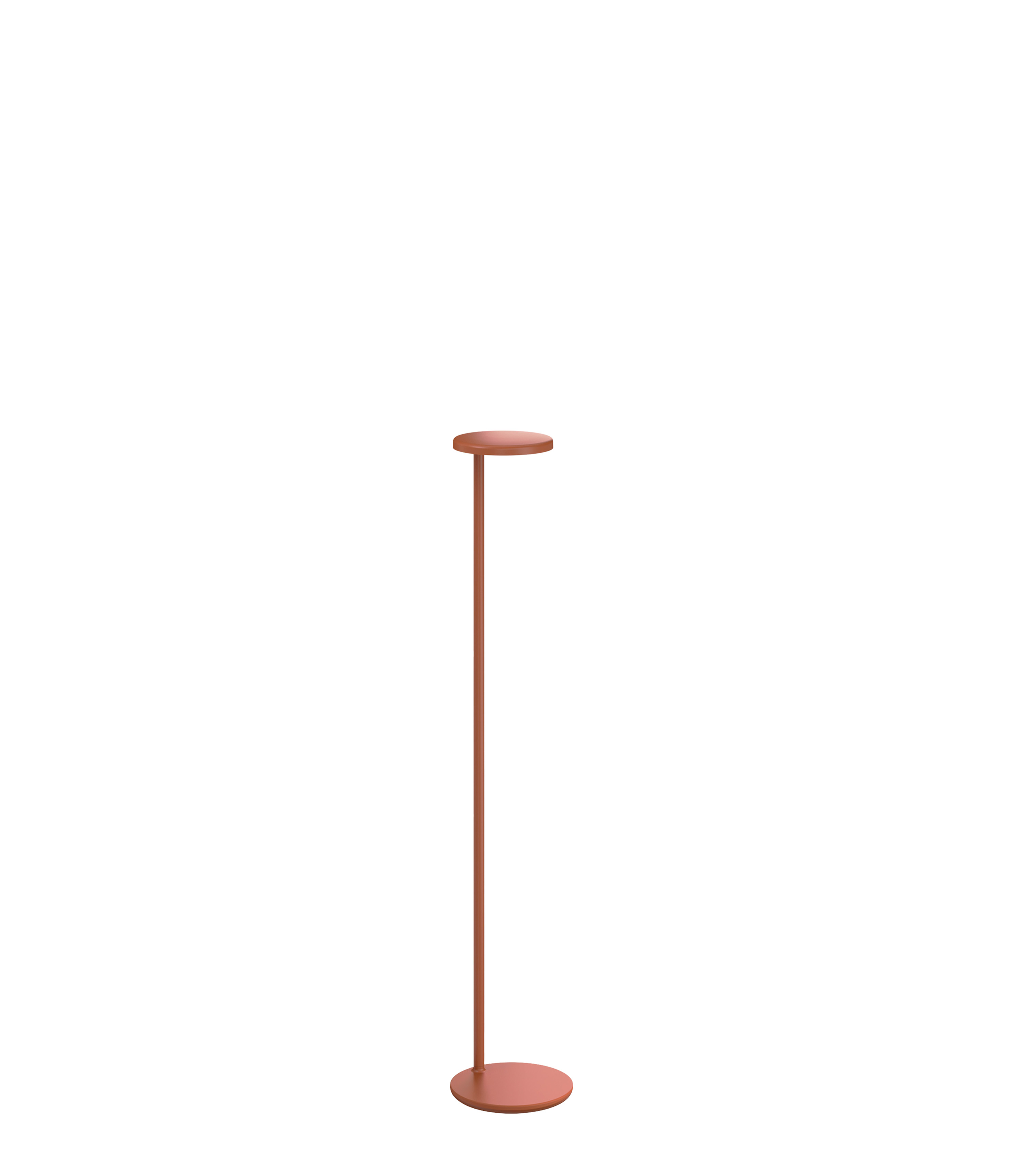
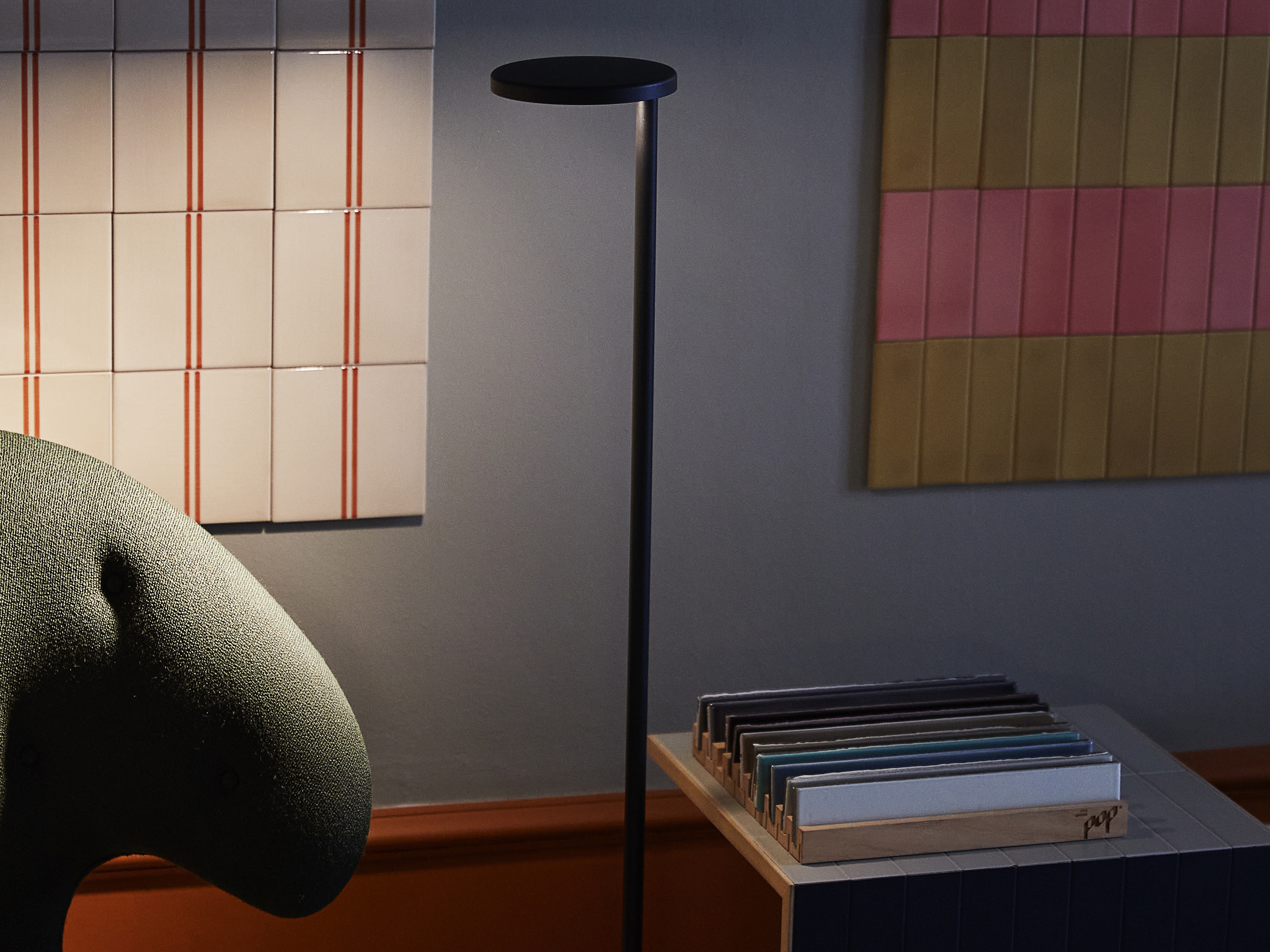
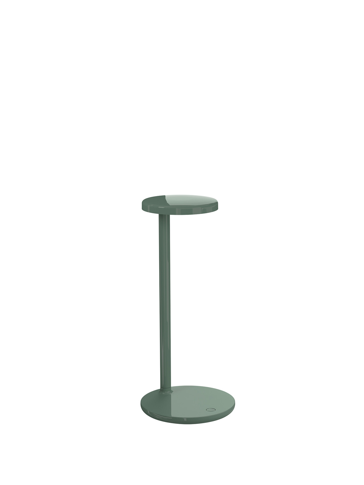
Lamps for living, Oblique in the new floor version.
Now reimagined with new proportions, Oblique Floor expands Van Duysen’s approach to minimalism into a myriad of domestic uses (and beyond). A lamp that is just as much at ease in the office as it is in an informal studio space or a home: its impeccably-developed light source encourages concentration, allows colours to emerge beautifully and lets its users approach it to best suit their needs.
Interview Rosa Bertoli - Photography Petra Kleis

Copenhagen, December 2021
We visit two local creatives at their home and studio to talk about their lives in design and creativity. They share their interiors and creative life, and tell us about a multifunctional approach to living and working. Their spaces are the perfect backdrops to introduce Oblique Floor, a new iteration of Vincent Van Duysen’s incredibly versatile, contemporary take on the classic office swing arm lamp.
Josephine Akvama Hoffmeyer
Danish-Ghanaian creative Josephine Akvama Hoffmeyer worked in music before becoming an interior designer, launching her brand File Under Pop in 2015. We step into her colourful universe, part studio, part ‘creative playground’, where materials are immersed in chromatic compositions, sublime geometries and fresh inspiration.
RB: What is your background?
JAH: I was born in Copenhagen. My mother is Danish, and my father is Ghanaian. It was a childhood full of contrasts, as they are complete opposites to each other as humans and in terms of culture, experiences, and expression. My professional background is rooted in music. I went to a high school focused on music, and grew up singing, dancing, and playing the piano. Music is my source of creativity: very literally earlier on in my professional life, but also now, when I translate the same source of creativity into a different field – surface design. To me, composing a room is very much like composing a piece of music.
RB: When did you decide to make design and creativity a professional career?
JAH: To me, there is a real connection between my past career as a musician, and what I do today. I spend a lot of time playing music and performing. I spent all my youth writing music, which to me is very similar to working with design. Creating music and designing a space require the same sense of sensibility – they stem from the same creative space within me. In that sense, it was not a decision to go into design, but a matter of change in my situation in life. I moved to Italy with no strings to the music scene there and simply had to start over in life. It was of course a crisis at the time, but also a gateway to a new expression of creativity. I really feel the same, I have just changed my focus of expression, but the process behind is very much the same.
RB: Colour is a major part of what you do – how do you approach it, both for your brand but also in the spaces where you live and work?
JAH: Colors are not just colors. Colors are light. Colors are materials. Colors consist of several factors in the situation of perceiving them. In that sense it is not enough to just talk about color, but rather to ask: Who is using the color, and in what context? What is the surface material? What is the texture and the feel? And of course, what is the function of it? This is what we do at File Under Pop – our entire team tries to translate color into values, emotions, and different stages of life. In a way, color is an instrument in our toolbox. We create volume, shape, and form with color. We find the right color for the right context and the people living their lives in it. To me, this is the philosophy of what I do. I recently moved into a new apartment with no nostalgic elements in the construction itself, and it was a real challenge to personalize it. I used light colors as a keynote throughout the space, and then made powerful impacts with bolder colors. I approached colors in the same way for my office, and even my summerhouse. I need lightness around me to think and be creative.
Ruben Hughes
Europe’s up and coming art director Ruben Hughes is a New Yorker transplanted in Copenhagen, where he has been working as an art director and creating visual content for leading design brands. We visit him in his minimalist Copenhagen apartment, where design classics are combined with soft lighting to create a cosy atmosphere for a space that doubles as a home and studio.
RB: How did you get interested in design?
RH: I've always had an interest in design and interiors. When I bought my first loft, I felt like I needed to place beautiful furniture in it, and my first chair that I ever got was the Eames chair, I still have it today. That was my first peek into design and it set the chain reaction of wanting to find myself in different designers and brands, and their stories.
RB: Let's talk about your home; is it also the place where you work?
RH: I pushed my home in a few different ways. One is very practical, I like everything to have a reason and a use. But it’s also a place of inspiration. I work in a few different ways, my home is kind of like a factory. I work at my desk when I'm trying to get work done, like powering through a presentation or taking a call, but when I'm creatively thinking about a project or concepting something it's always on the couch because it's the most comfortable place to sit. Most of the ideas that turned into an art installation or a campaign have been created sitting on a couch. A lot of ideas come from there, I have a lot of books in the living room and I use it as a place of inspiration where I can think and where I can bounce ideas around. And then when I activate that concept, that seed, I bring it over to my desk where I could sit down and really work on things. So it's a much more productive space where I could transform that inspiration into the project. And my bedroom is very simple. I use it as a shutdown space, to clear my mind out. So I walk in and everything is quite simple and beautiful.
RB: How would you approach the light in your home? I imagine Copenhagen can be quite dark, especially in winter.
RH: Denmark is certainly an extreme climate country. In the summertime the sun is literally just basking through. You can't find a corner that is not sunny. And then in the wintertime it can get quite dark. Good lighting is important in Denmark because you don't get a lot of it during this time of the year. So I approach the lighting depending on the room. For example, in my bedroom I use the lighting as just a reading area on the side of the bed. But I actually move the light a lot. I have reading lamps by my couch, I like a nice soft light. I really enjoy having cosy lighting in winter, not too strong. It doesn’t really light up the room, just gives it a looming feeling. It's kind of still dark but then you have the practical lighting as well. So anything with a dimmer.

RB: How do you approach the interiors of this space? What role does light – natural and artificial – play?
JAH: Light is very important. In our work, we create people’s homes and architectural projects, and light is an important part of it all. File Under Pop Studio is our creative playground, and part of our everyday lives. In the beginning, I kept the studio space very focused on surface design, but over the years, the impact of interaction between people, objects, furniture, and light has become more prevalent. We move around objects, experiment with color and really try to create a space that moves people, when they visit it.
RB: You have been working with Oblique and Oblique Floor in your studio – what can you tell me about using these lamps as a functional light source and object?
JAH: The lamp takes up very little space. In fact, it almost doesn’t appear as a lamp. It reminds me of a node resting on the lines of a piece of music. It has a lightness that makes it interact easily with many different interiors. And then, it is super technical. The light is cast quite long, which you do not expect from the slender design.
RB: How does the two lamps’ functionality adapt to specific functions within your studio?
JAH: It works well as a working lamp. The long and wide beam means you don’t have to sit very close to it to catch a decent light while working. At our office, we can sit around a large desk and share the light from one or two lamps while working – at the same time, it does not even take up a lot of space. We are constantly in contact with our clients regarding colors – all the way down to the detailed aspect of a color. So, a decent working light is very useful at our studio, and even a necessity in the long, dark winter period in Scandinavia.
RB: How has it been to experience Oblique in your home?
RH: It’s a beautifully minimalist lamp that fits right into the surroundings of my home. I really enjoy the power of the lamp’s light, especially when reading on the couch or sitting at my home workspace.
RB: How does the lamp’s functionality adapt to specific moments of your everyday life?
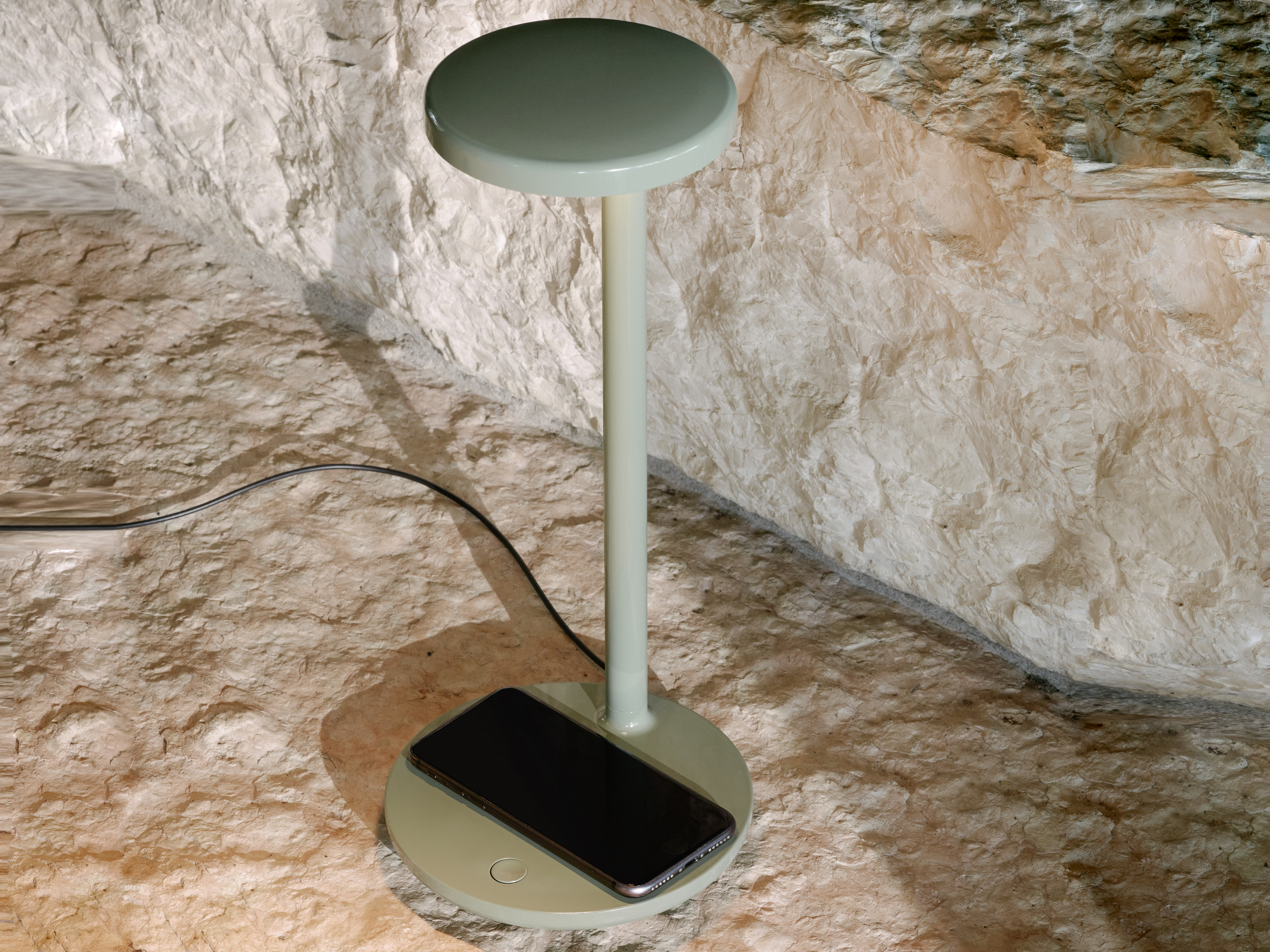
RH: There’s a lot of uses that go beyond light. Having a base that’s integrated with a wireless charging system allows me to charge my phone while on-going various tasks at home. I even noticed an additional port in the back for other additional charging opportunities. I love that this lamp expands on functionality while still remaining its design aesthetic.
RB: You are a keen admirer of Vincent Van Duysen’s work. What attracts you the most to his aesthetics and practice?
RH: I have been studying his work for a few years. Vincent Van Duysen’s designs are always timeless and functional. I have taken inspiration from his interior projects when exploring design choices for my home. I can recognize his ‘hand’ for this reason. Having the Oblique lamp feels right in line and in use with the space.


